I want to sign-in using my social media account
User Type: Returning User
Priority Level: High
Feature Type: Account Services
Klutch is a cloud storage product that caters to designers, DIYers, and hobbyists that define the Pinterest and YouTube generation.
Duration: ~7/8 months while working
Millennial creatives (students, professionals, and hobbyists) use multiple types of online sources to inform their research and work, but gathering these disparate sources (in the form of images, videos, articles, and blogs) can often be frustrating and time-consuming.
A visually-oriented web app that allows images, videos, articles, and blogs to live together in customizable groups. The biggest painpoint with existing storage apps these days was the limited abilities to organize and customize, so I paid special attention to these features.
Due to its wide success, Google Drive offers a good starting point in thinking about where users are starting from. What do users already know? What are they used to?
Bear app is a great example of how targeting a specific market while with placing a high value on usability can lead to a successful product.
Though pCloud offers encryption technologies on a bigger scale, from a usability standpoint, it was not as intuitive as other products.
Who were surveyed?
97%
Millennials
42%
In Design Field
What cloud services do users use?
79%
Google Drive
70%
2 or More Services
55%
Dropbox
Top Useful Feature
Sharing + Collaboration
Top User Painpoint
Customization + Organization
The strongest statistics revealed that a significant number of Millennial creatives use two or more services for their cloud needs, which means that this particular group is fond of a variety of tools and accustomed to change.
With Bear having shown that a niche, targeted cloud service can be successful, the next thought was to define this demographic more clearly and identify their needs.
So the natural question was what services do Millennial creatives use to gather ideas? What is their take on this a new type of service? This called for a second survey.
Top sites for inspiration
Do you think you would benefit from a cloud site that can save your images, videos, and articles from the web all in one place?
Yes
Maybe
No
“…Pinterest…was always limited to linked images. I want a place where I can put all creative ideas together, make notes and shuffle them around like a mindmap.”
-Artist
“I currently have an ongoing email chain to myself where I include links to websites or articles that interest me. This proposed cloud site could do a better job.”
-Architect
What do designers, DIYers, and hobbyists have in common? The ability to think and be inspired visually. But they also use a variety of web services to gather their content, which can be images, videos, articles, and blogs.
Without even being shown an image of the possible product, most of those surveyed were optimistic of the proposed idea.
“There are many products out there, but Google Drive has been my favorite because it’s accessible, easy to use, and collaborative. However, it can do with some UI and organization updates.”
“I draw my inspirations from everything and anything. It would be great to get a mental map of all my online things in an easier way.”
“I dabble in a bit of photography with no formal background. So I draw a lot my inspiration and learnings from a variety of online sources; from blogs, portfolios, magazines, to YouTube tutorials.”
User stories were put into an excel sheet and categorized by priority level (low, medium, high) and feature type. For this concept project, highest priority items were incorporated, while only a few medium and low priority items. Some examples:
Iteration 1 (initial sketch)
Iteration 2 (vectorized, more thorough, cleaned up)
Iteration 3 (stylized, simplified, shows users a way out)
Iteration 1 (initial sketch)
Iteration 2 (vectorized + cleaned up)
Iteration 3 (stylized, simplified, shows users a way out)
See All User Flows in Google Drive
User flows revealed the amount of steps necessary to accomplish each user goal.
Here, I started to think about how to organize these goals and where they should belong in relation to each other.
Separating functions from static pages helped me organize my thoughts and carry over organizational concepts into wireframes. Additionally, the sitemap helped me prioritize what functions should be more prominent based on user research.
1 of 28
Sketching helped me think about the overall layout patterns for the product and where I should start thinking about putting functions and how users will interact with them.
My goal was to keep the interface as clean as possible to free users from distractions.
One thing that was hard to see with just the sketched wireframes was the overall flow of the product. Digitizing the sketches and visualizing the flow further helped to organize the architecture of the product.
For naming the product, I sought after words that are associated with my method of organizing content: grouping. After some research, I came upon the word, “clutch”.
Clutch can mean to group, refers to a group of eggs, and has the meaning “to hatch” associated with it. After some sketching the egg seemed the simplest form to work with.
Klutch’s color palette offers the exuberance of dark pink and bright blue while having a range of oranges to convey warmth and light. The palette also has a range of dark and light gradients to add a sense of movement, depth, dynamism, and ambiance when necessary. The cool neutrals add a calmness to balance the other colors out.
Since Klutch aims to be a relatable product that also solves organizational problems, there needed to be a balance of both emotional and rational concepts. The two typefaces, Quicksand (humanist/emotional) and Heebo (geometric/rational), are not starkly different, but different enough to work well when one is bold and other is light.
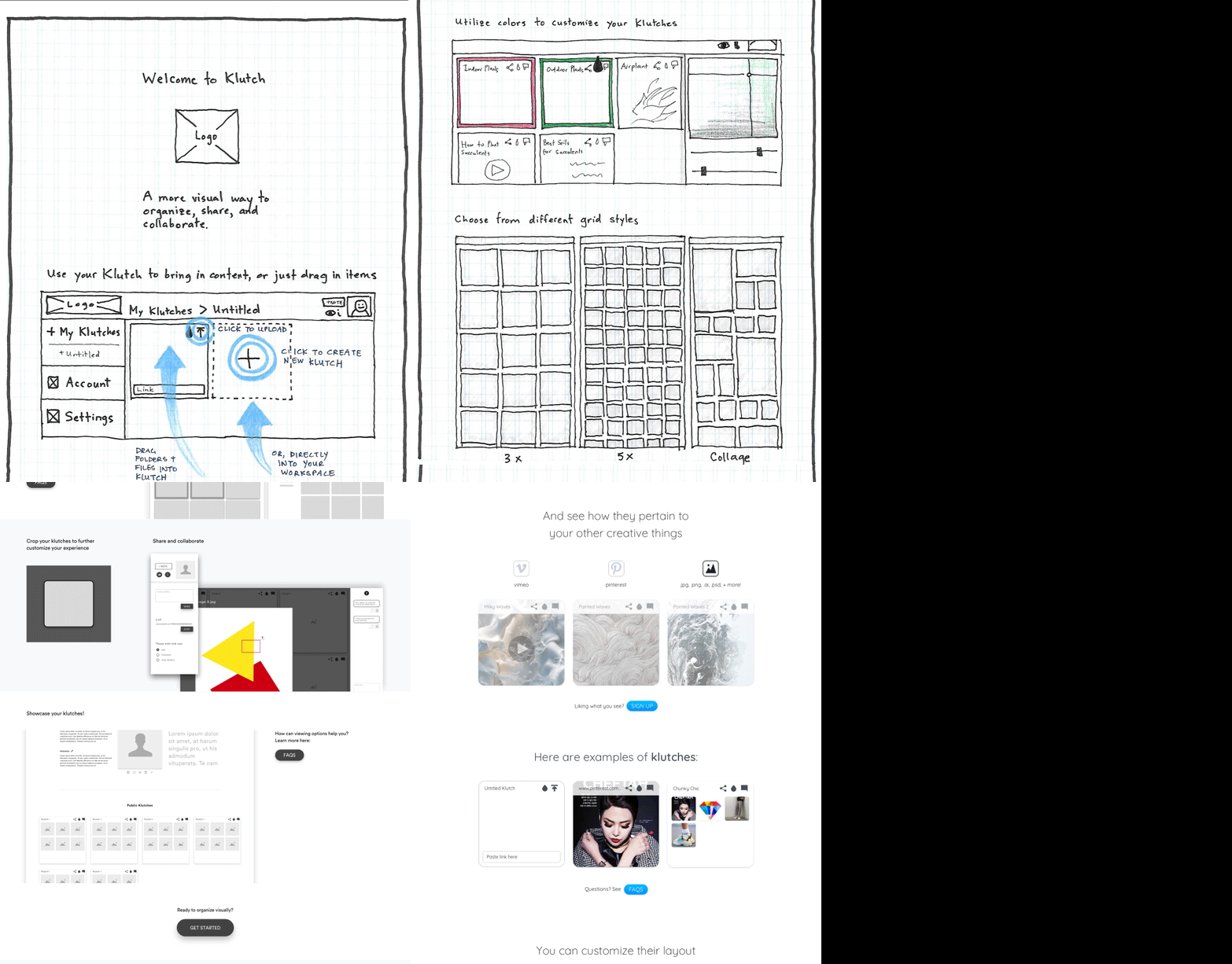
The landing page was initially conceptualized as a “how-to” page (shown in the sketches). Through testing, I realized that a combination of the more generalized approach of the lo-fi pages with the info of the how-to approach engaged users more effectively.
User testing revealed that having example content of different media types, along with user-activated instructions, allowed users to understand how to use the product.
A right-click to reveal more tools, according to users, was an extra step and not straight-forward. So, for the last iteration the extra tools menu was hover-activated.
Explaining how to use the product was an important part of product design from the beginning. I spent a bit of time figuring out how to visually show the drag and drop features that simplify the user experience.
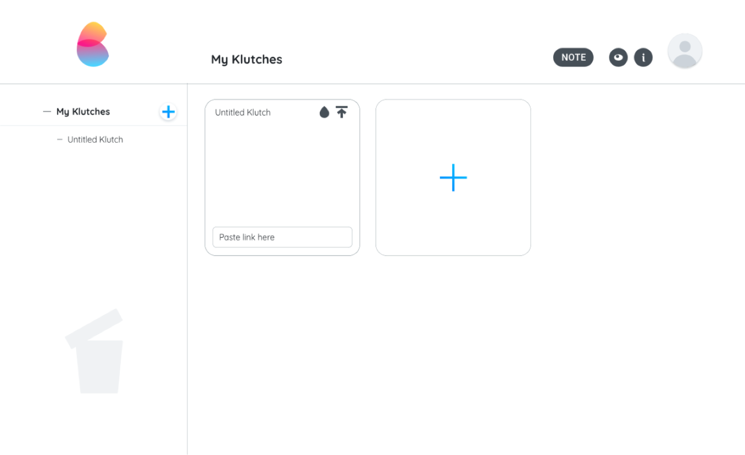
67%
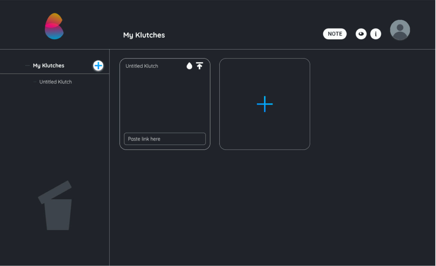
33%
Twice the number of users preferred the light version. Additionally, objectively the lighter version proves to be clearer to read.
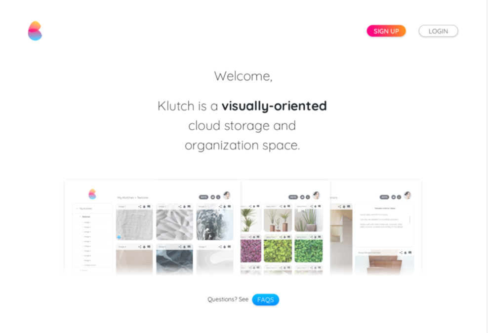
36%
7%
57%
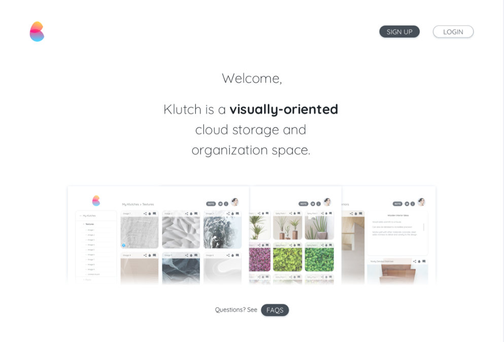
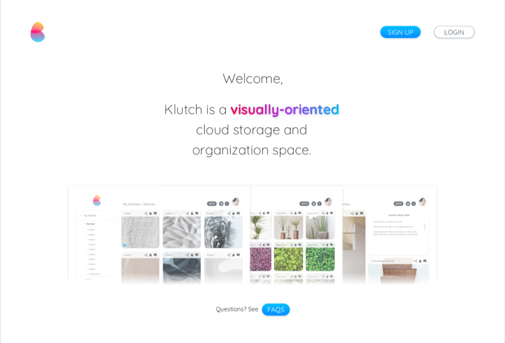
I agree that the third option is the most engaging, with gradient letters and blue leading the eye down the page.
44%
56%
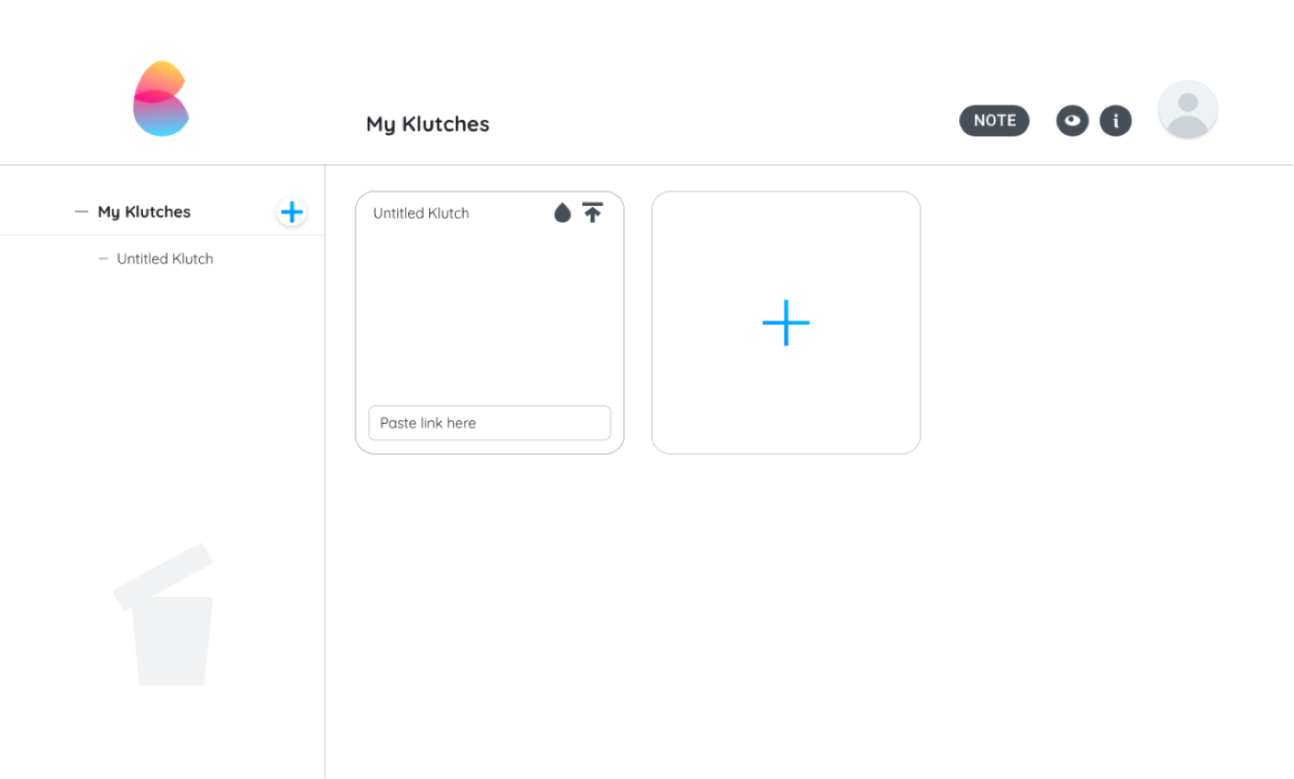
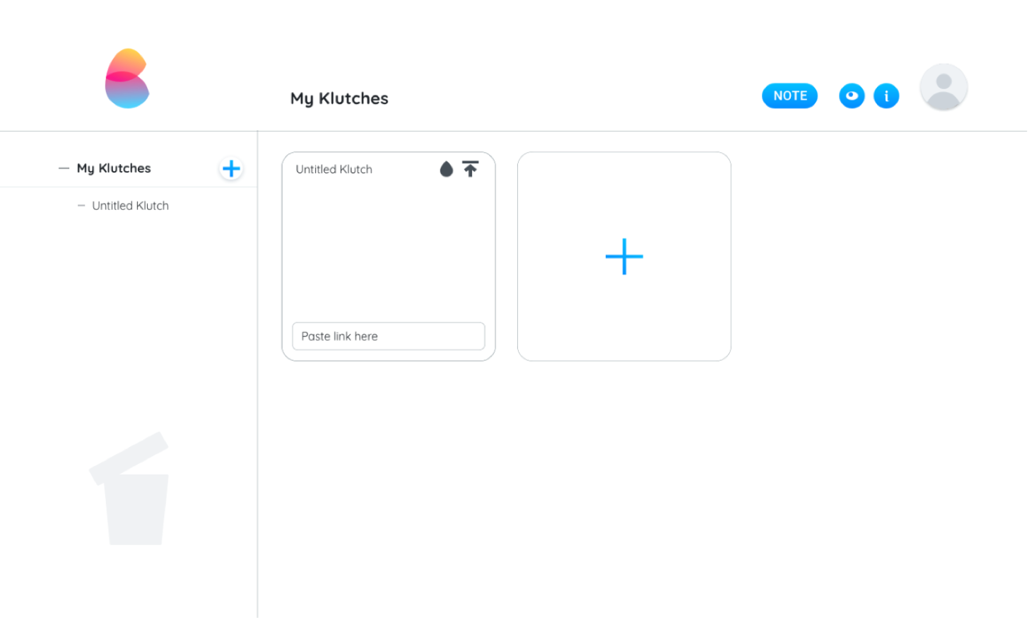
The overall layout of Klutch. The left panel that shows a hierarchical structure of files helps users orient where they are while the visual grid on the right helps users gather their content intuitively.
This configuration worked consistently well with users, though I do wonder if there were more options I could’ve tested earlier on.
Looking back, I wish I’d dug deeper into how users would want to use Klutch by observing and/or inquiring about users’ actual workflows to accomplish their creative tasks/goals. Where do they store specific items? Do they print things? How do they save online content usually and for what? How do their projects come together currently?
I would’ve also liked to further develop the community function in the profile portion of the product. I think there’s a lot of possibility in people seeing each other’s curated klutches.
Additionally, if I had more time, I would’ve liked to test how to solve the “shared with me” issue. A notable complaint from cloud users was that it’s hard to keep track of what’s been shared and shared with them. With the “shared with me” folder being hard sift through in Google Drive, I wonder what solutions we could come to through testing.
Another element I’d like to mention is the “view” and “information” icons; they should have been accompanied by text.